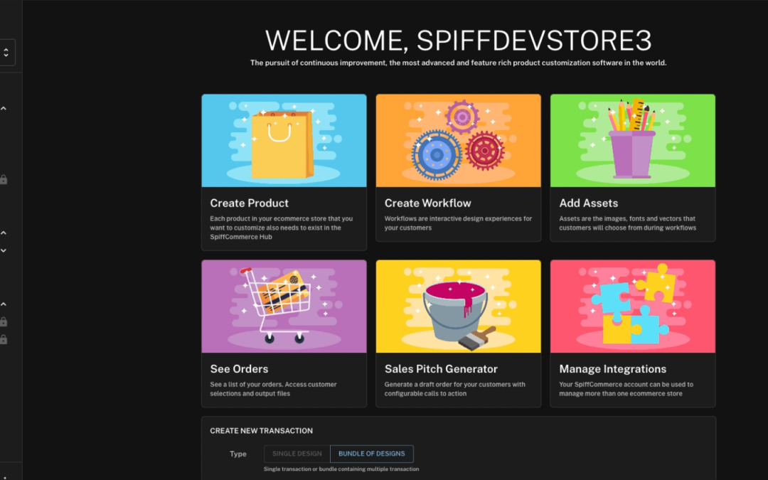
As we welcome the new year, we’re thrilled to unveil a revamped UI layout for the Spiff hub, designed to deliver a more polished and intuitive user experience.
Through using the platform ourselves and having direct conversations with our customers too, we’ve found that navigation within the hub wasn’t immediately clear to users new and old, and the organization of components and features often felt overwhelming and confusing. The previous design felt like it leaned more toward a conventional website homepage rather than showcasing a robust, full-featured solution.
With this feedback in mind, we’ve reimagined the layout, introduced a sleek sidebar configuration that enhances usability, streamlines navigation, and made the hub more accessible in general. And for those late-night sessions, we’ve also added a light/dark mode toggle to make the experience easier on the eyes.
____________________________________________________________________
Navigation
Rather than having to aim your mouse at the right spot and keep it in the confines of the original header dropdowns, the UI now uses simple toggleable dropdowns with the arrows seen to the right of each listed group. Simply click the arrow or the title of the group to open, and click the same arrow or group title to close.
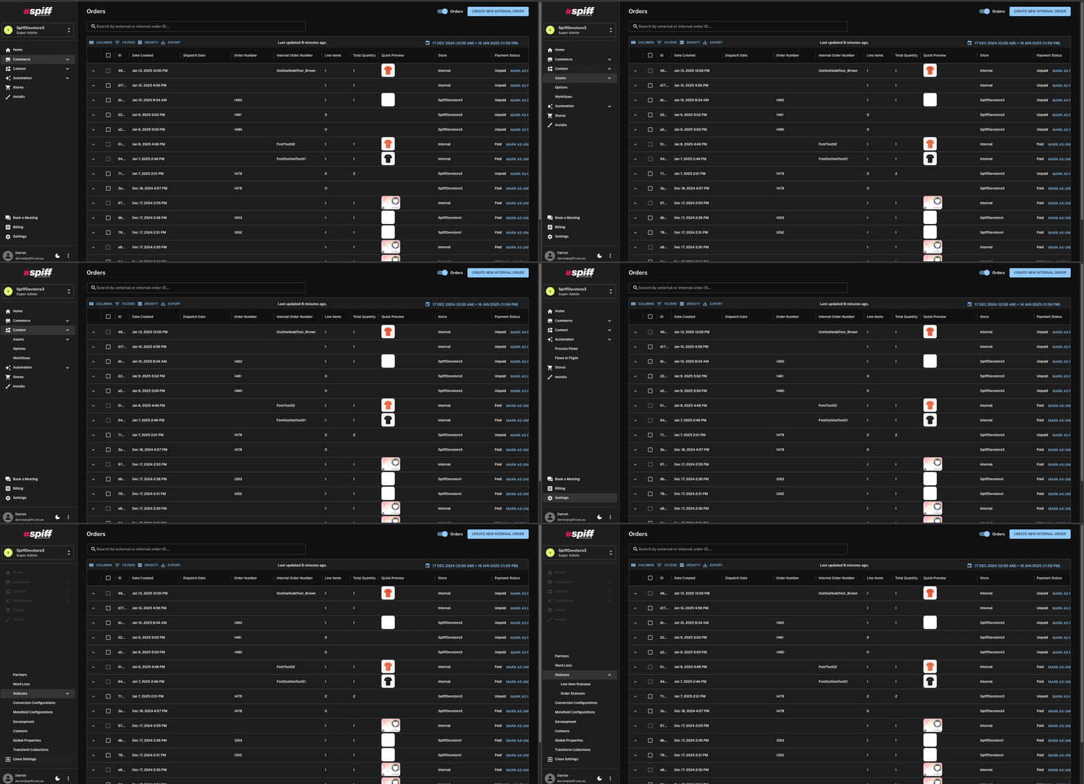
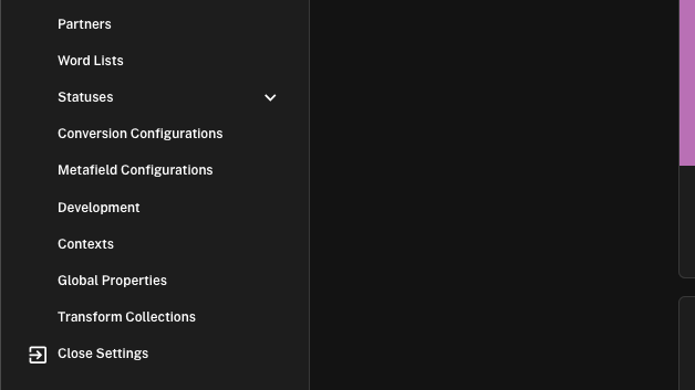
The only differing component of the UI in this regard is the Store/Partner tab, and “Settings”. To access settings, simply click on it, and to close, use the “Close settings” listing found at the bottom of the pop-up list.
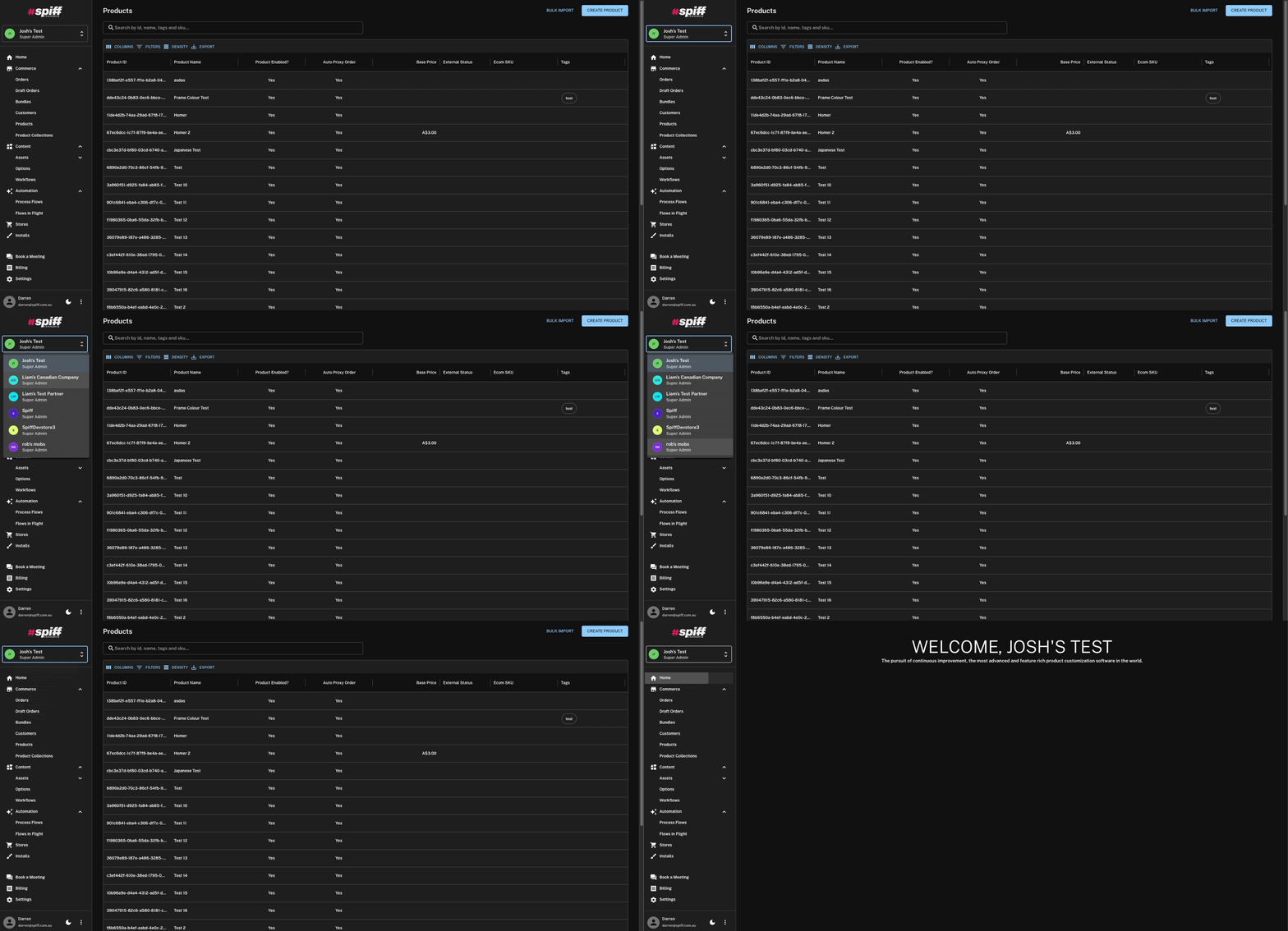
In cases where your account is tied to multiple stores – stores that your account is a “Partner” of or to which you are an admin, simply click the top section to open the store/partner dropdown and switch with ease.
____________________________________________________________________
Dark Mode
We’ve enhanced the Spiff Hub further with the addition of a dark/light mode, giving users the ability to switch between light and dark themes based on their preference or environment. Whether you’re working as a night owl or prefer a softer visual experience during the day, this new feature ensures that the platform performs the way you need it to and feels great to use regardless of the time.
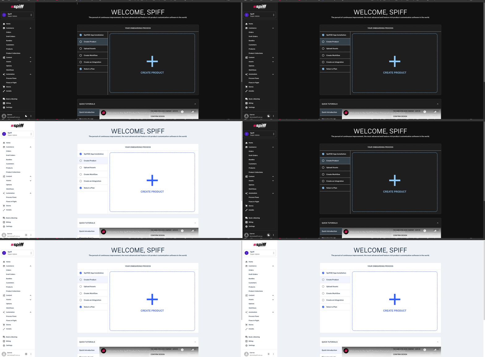
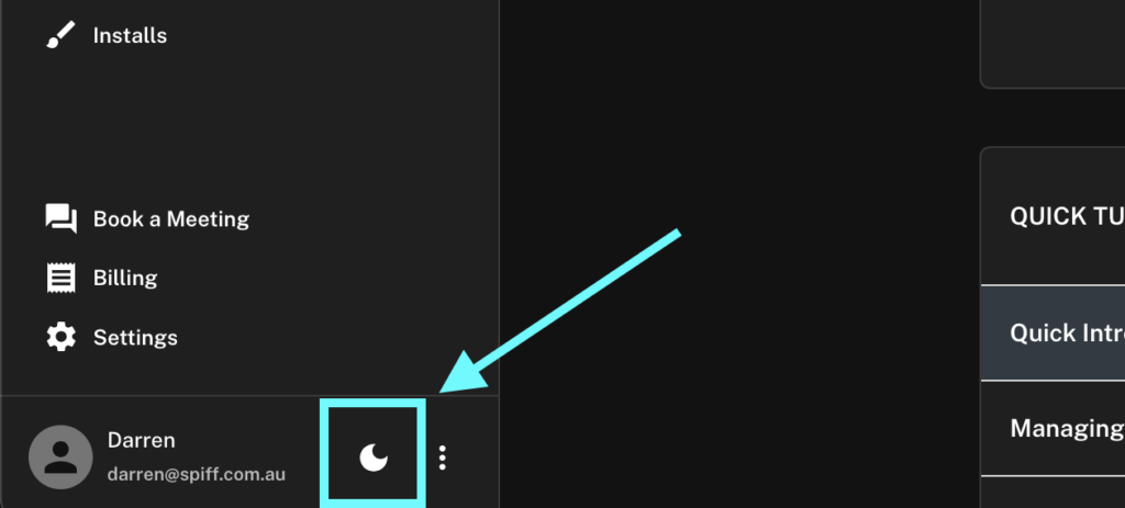
Use the Sun/Moon toggle next to your account name towards the bottom of the sidebar to switch between light and dark mode.
____________________________________________________________________
Commerce
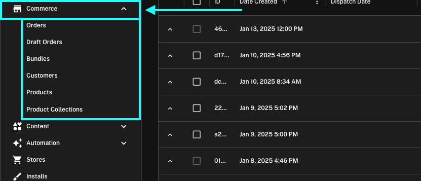
Originally found in the top header, the Commerce tab has also been shifted over. The Commerce tab is otherwise unchanged.
____________________________________________________________________
Content
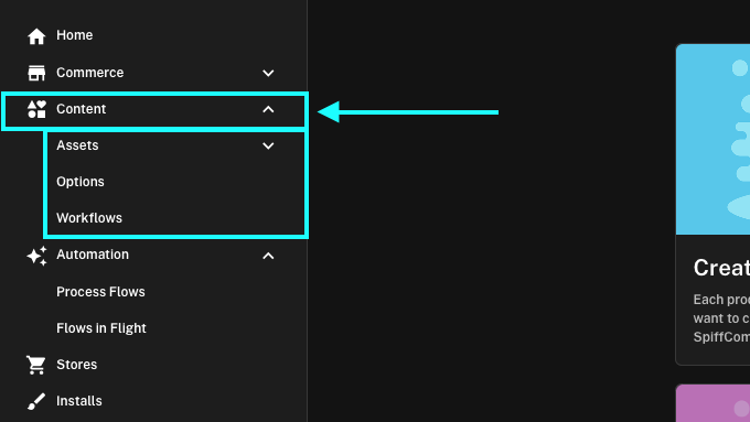
The Content tab has been refreshed and reorganized to more accurately represent the tab’s purpose. Global Properties and Transform Collections have been moved to the “Settings” section. Additionally, the “Materials” tab has been added to the “Assets” dropdown directly, providing a more logical and streamlined structure.
____________________________________________________________________
Automation
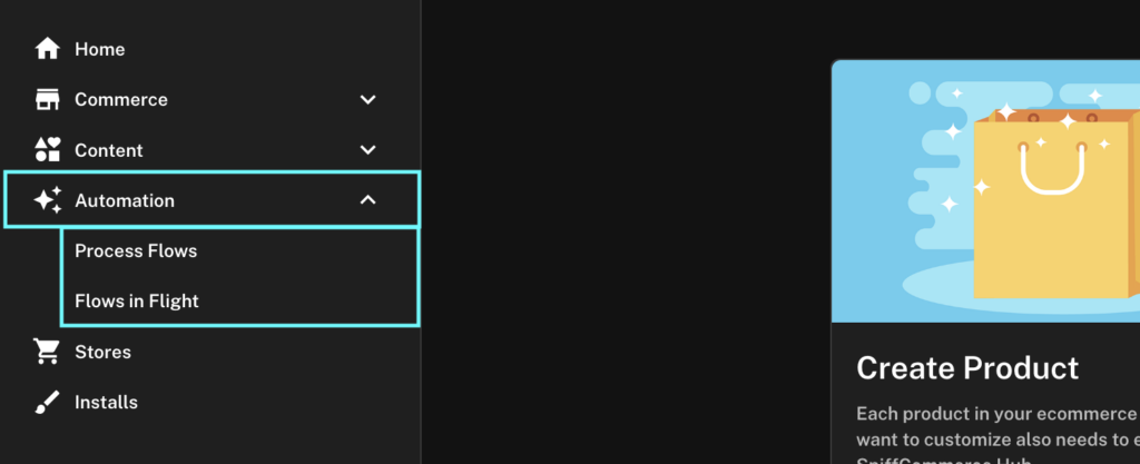
The Automation tab remains unchanged aside from the “Contexts” page, this has been relocated to the Settings page.
____________________________________________________________________
Settings
Configurations and components that are used infrequently, and typically only require setup during initial implementation, have been relocated to keep things concise. To further simplify navigation and keep things clean, these components, along with others where it makes sense, have been relocated to the “Settings” section, conveniently found near the bottom of the sidebar.
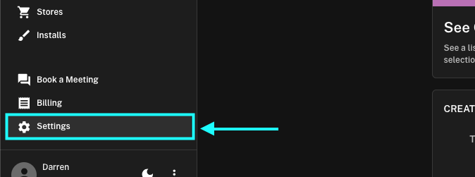
Here you will now find metafield settings, conversion configurations, profanity or other lists of words to use within the platform, global settings and more.
____________________________________________________________________
That’s It!
The changes we’ve made here were long overdue and we’re proud to present this at the start of the new year, but most importantly, Happy New Year!

