Text steps are used in workflows to add text to a user’s design. You can have as many text steps as you like in a workflow, these steps are very configurable. Text steps allow the customer to be able to type, choose a font, choose a color, and more.
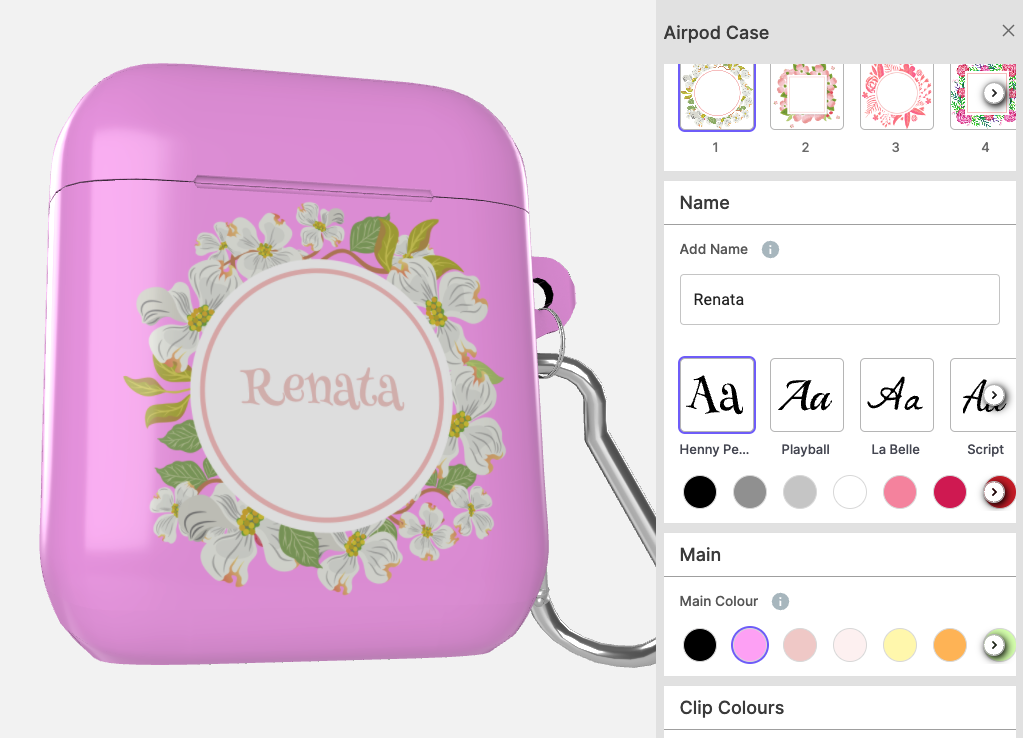
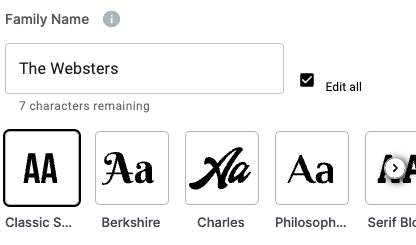
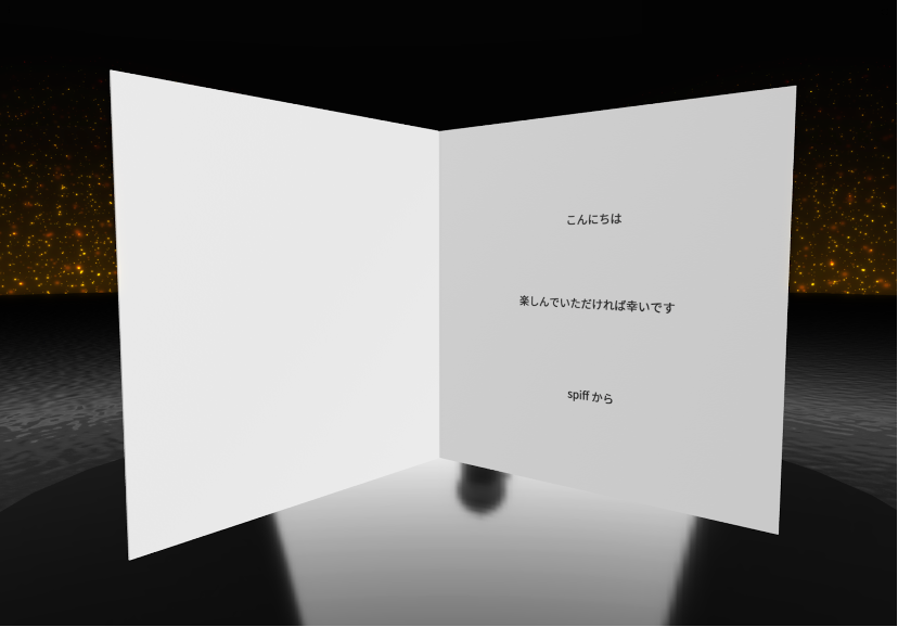
Here is an example of how a text step appears in our Beeline Theme.
Configurations
When setting up text steps there is a range of configurations you can set, such as:
- Size
- Color selection
- Set max width
- Set max/min characters
- Set case
- Default text
- Replaceable text
- Vertical text
- Font library
- Alignment
- Justification
- Delete default on focus

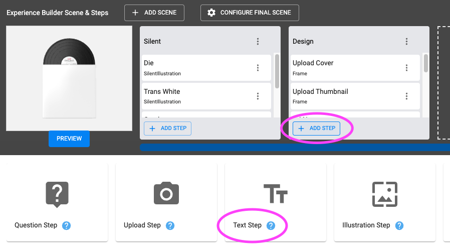
Setting up a Text Step
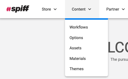
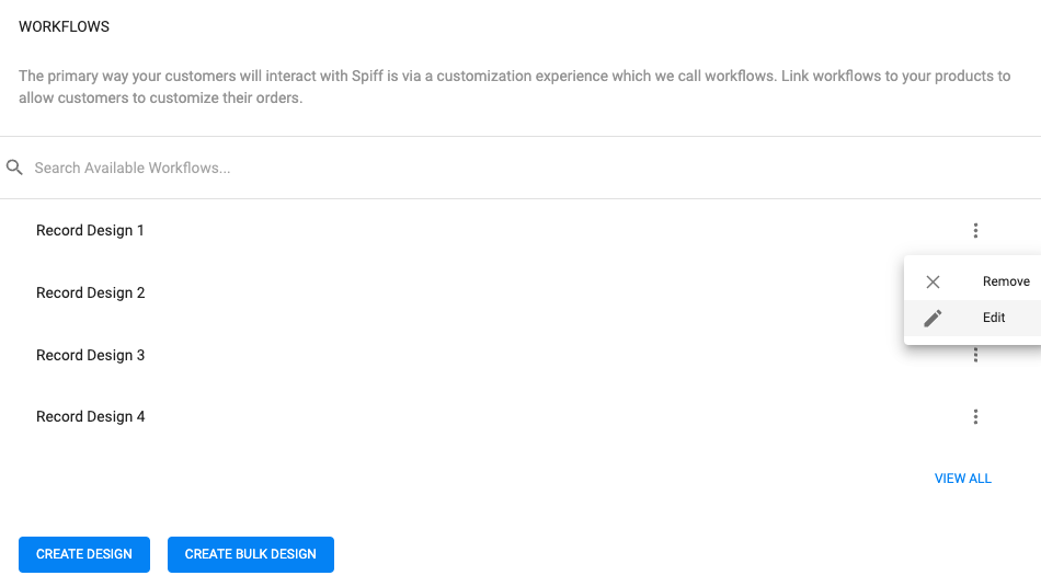
As with all steps, you must be logged into the SpiffHub and be in a workflow to get started on setting your step up. You can find Workflows underneath the Content tab.
Note: You can also log straight into a workflow through the product if it is already linked. To do this, go to the edit product page, and in the first cards (Workflows) click on the three dots to the right of the workflow name in the list displayed.
In the Workflow
- Once you are in a Workflow, to add a new text step you click the ‘Add Step’ button at the bottom of a scene and then select the ‘Text Step”
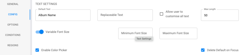
- Fill out all relevant configurations in the Config tab
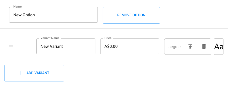
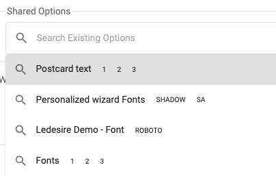
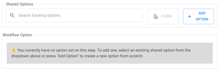
- Now you have set all your configurations it’s time to add your fonts. Navigate to the Options tab, it is the one under the Config tab you are currently on. Here you can manually add fonts from your Assets or choose from existing shared Option.
How it looks when adding new Assets. You can name your Varients and set a price. When you have multiple Varients you can also reorder them and set a default.
How it looks adding an existing Option. These are set up in Options under the Content tab.
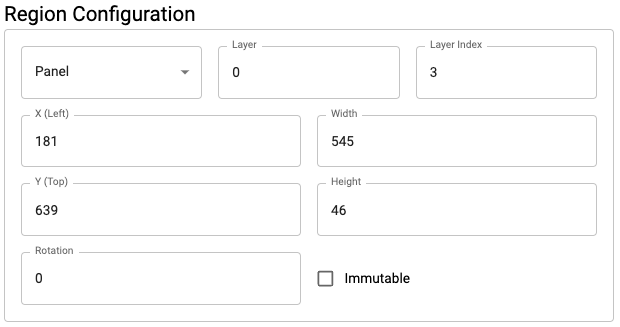
- Lastly, you need to set your Regions before the text step will work.
Once you’ve done this, save your Workflow and check it out!
Config in Detail
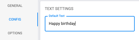
Default Text
The default text feature allows you to set the text that will appear when your customer first opens the workflow experience. This feature is commonly used to either guide the customer through recommended messages such as: “Happy Birthday”, or as a placeholder so that the model does not look blank when it is first viewed by the customer.
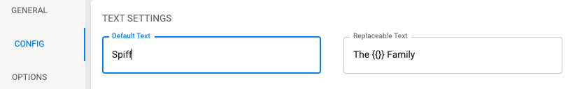
Replaceable Text
The replaceable text can be used so that customers can only edit a component of the default text. For example, as the merchant we can set the default text to say “From the Spiff Family” but the only text that we want the customer to edit is the “Spiff” component so that the customer can write in their own family name without changing the surrounding text.
To do this, set the default text to the changeable element, which in this case is “Spiff”. Within the replaceable text field write “From the {{}} Family”.
Edit All
You can allow further configuration of the replaceable text step by ticking the ‘edit all’ box. This means that customers can edit all the replaceable text if they want to change more than just the text within the ‘{{}}’ field. When customers select the ‘edit all’ box they will then be able to change the whole text.
The ‘edit all’ feature is best used in conjunction with replaceable text in a situation where you want to guide the customer through your customization experience promptly by allowing them to change a few words within a broader sentence. However, by selecting the ‘edit all’ feature, they can still have ultimate control of the text if they wish.
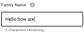
Max Length
The max length configuration allows you to set the maximum number of characters that customers can type within the text step. The character limit includes special characters and spaces. Customers will see a certain number of characters remaining underneath the text field.
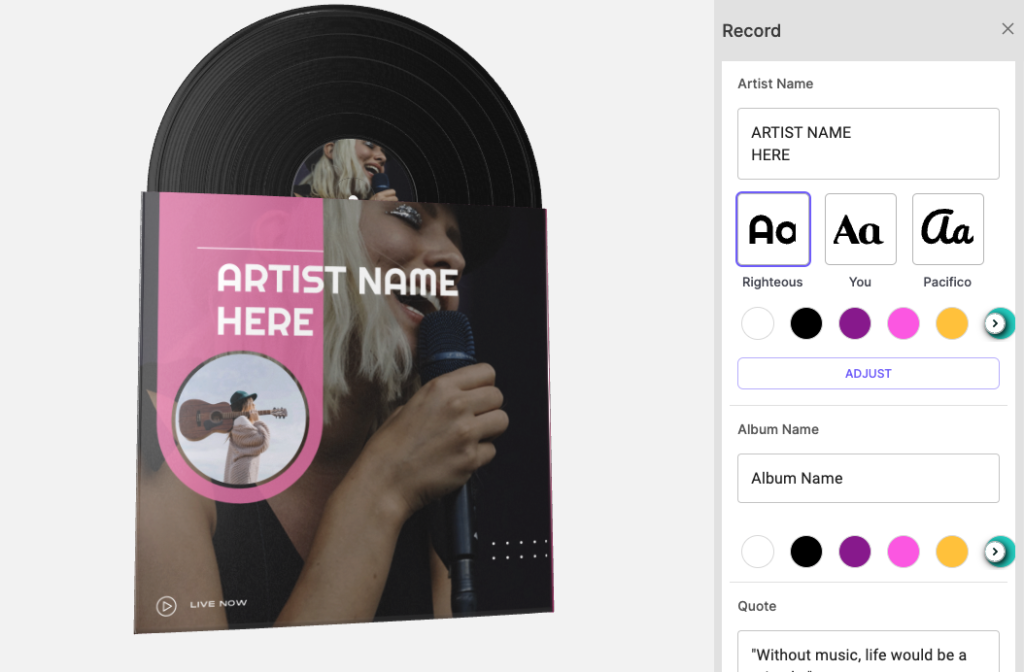
The below image shows what the client sees when they type in their message.
Variable Font Size
Within the text step configuration, as the merchant, you have the option to control if the font resizes automatically depending on the number of characters the customer inputs or whether the font size stays the same regardless.
The font size is set in points, like any design program such as Adobe Illustrator and Photoshop.
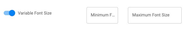
When variable font size is toggled you will be presented with maximum and minimum limits. The maximum means the customer has only inputted one letter, and this is the largest font size will be. The minimum limit, conversely, is the smallest the font size will go. When the variable font size is not toggled you can set a font size, in points, that the text will remain as regardless of the number of characters that the customer has inputted.
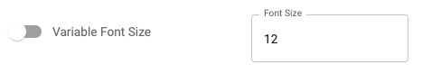
It is important to ensure that the region height and width size can accommodate the font sizes set in the workflow back-end. For example, if you have set the font size to remain 12 points, the region height needs to be at least 13 to account for padding within the font file. If the region height or width is not respected, the customer will receive a warning message saying: “Text does not fit in one or more textboxes.” and will not be able to type any further characters.
Default Color
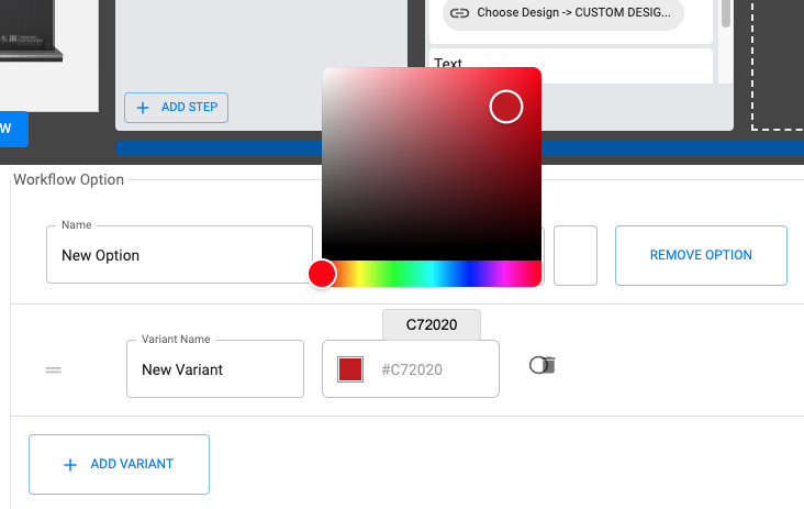
The default color feature allows you to set the color that the text step loads in. To set a default color, you need to add an Option. You can either choose from an existing Option. Or create a new one.
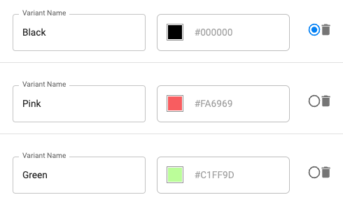
If you have chosen to add a new Option, you then add varients. You can name your varients, reorder, set defaults and most importantly choose your color.
Color Picker
If you want to give customers the choice of changing the color of their text, you can tick the ‘enable color picker’ box. This will allow any colors you have set in your Option to display in the workflow. You can add any colors you want.
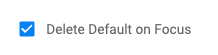
Delete Default on Focus
The delete default on focus feature will remove the default text when a customer clicks on the text step. When this feature is turned off, the customer will be required to manually delete the default text to write their own text.
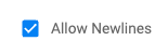
Allow New Lines
The allow newlines feature enables customers to type across multiple lines of text by pressing enter on their workflow.
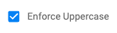
Enforce Uppercase
Enforcing uppercase means that text will always be typed in caps lock no matter what font is used.
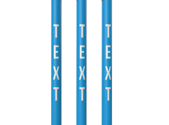
Vertical Text
The vertical text configuration makes the customer’s text written vertically as opposed to the default horizontal.
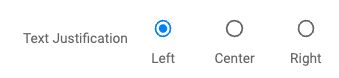
Text Justification
You are able to justify your text in three ways. Left, center, or right. This means that the text will start typing from the justification you choose.
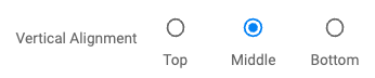
Vertical Alignment
You are able to align your text vertically in three ways. Top, middle, and bottom. This will decide where the text is placed in your Region.
Multi Languages
The Spiff3D platform supports all languages and characters.
 If you are receiving the following message: “This character is not compatible with the current font” this is due to the current font not supporting the character or accent. To ensure this does not happen to your customers, you must upload into the Spiff3D platform any TTF or OTF which supports those characters and use those in the workflow builder.
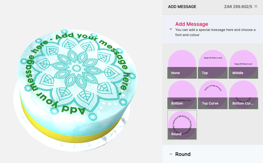
Curved or Rounded Text
Curved and round text is supported in the Spiff platform but is currently a feature only available in the Spiff backend.
To create a curved text option for your products please reach out to support@spiff.com.au